sunlighten day spa
Sunlighten Day Spa began as a commercial testing ground for Sunlighten's infrared saunas. After nearly a decade operating as a separate entity, the business was ready to integrate with the master brand under a unified identity. The challenge was a meaningful one: transitioning from a house of brands to a branded house without losing what made the day spa distinct.
the audit
Every rebrand starts with an honest look at what exists. The original Sunlight Day Spa identity lacked color consistency and failed to capture what clients actually felt after a service: refreshed, rejuvenated, and at ease. There was also a differentiation problem. The existing mark had elements too reminiscent of Sephora's iconic S, which created confusion rather than identity. A full redesign was the right call.
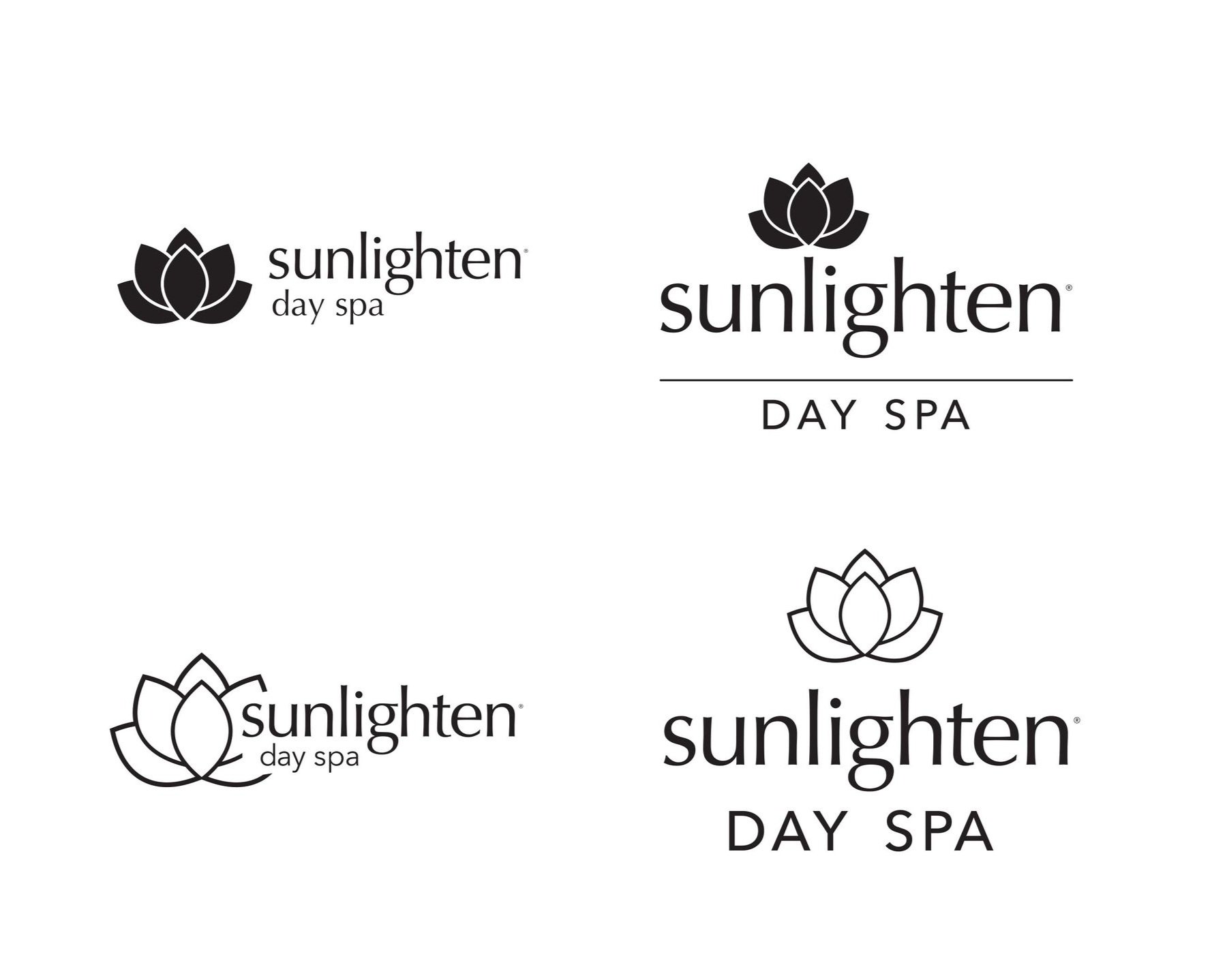

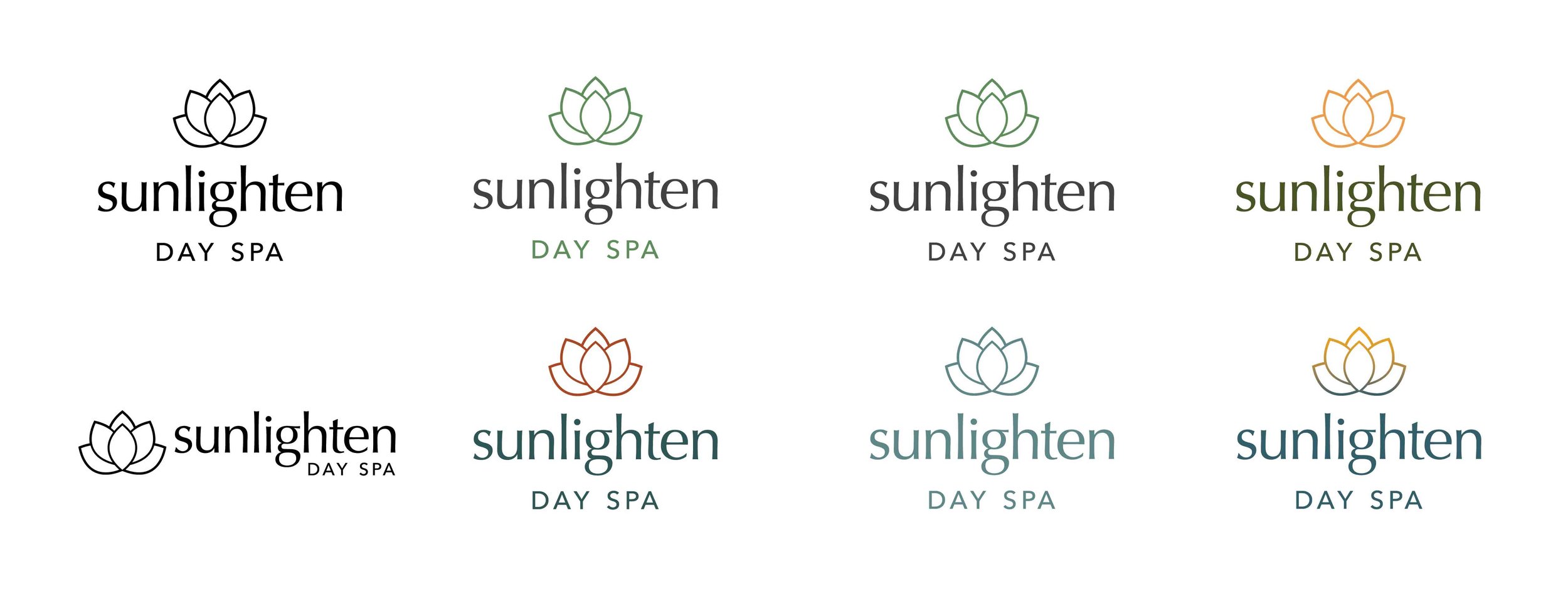
finding the mark
Logo exploration started with hand sketches presented directly to the owner and managers, using early rounds to gauge the balance between distinctiveness and alignment with the master brand. The chosen direction, selected for its calming elegance and subtle symmetry, gave the brand a quiet confidence that felt appropriate for a wellness environment without drifting too far from Sunlighten's established visual language.
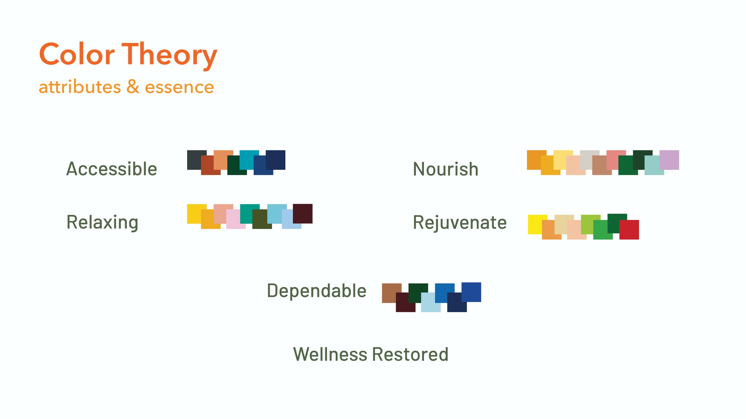
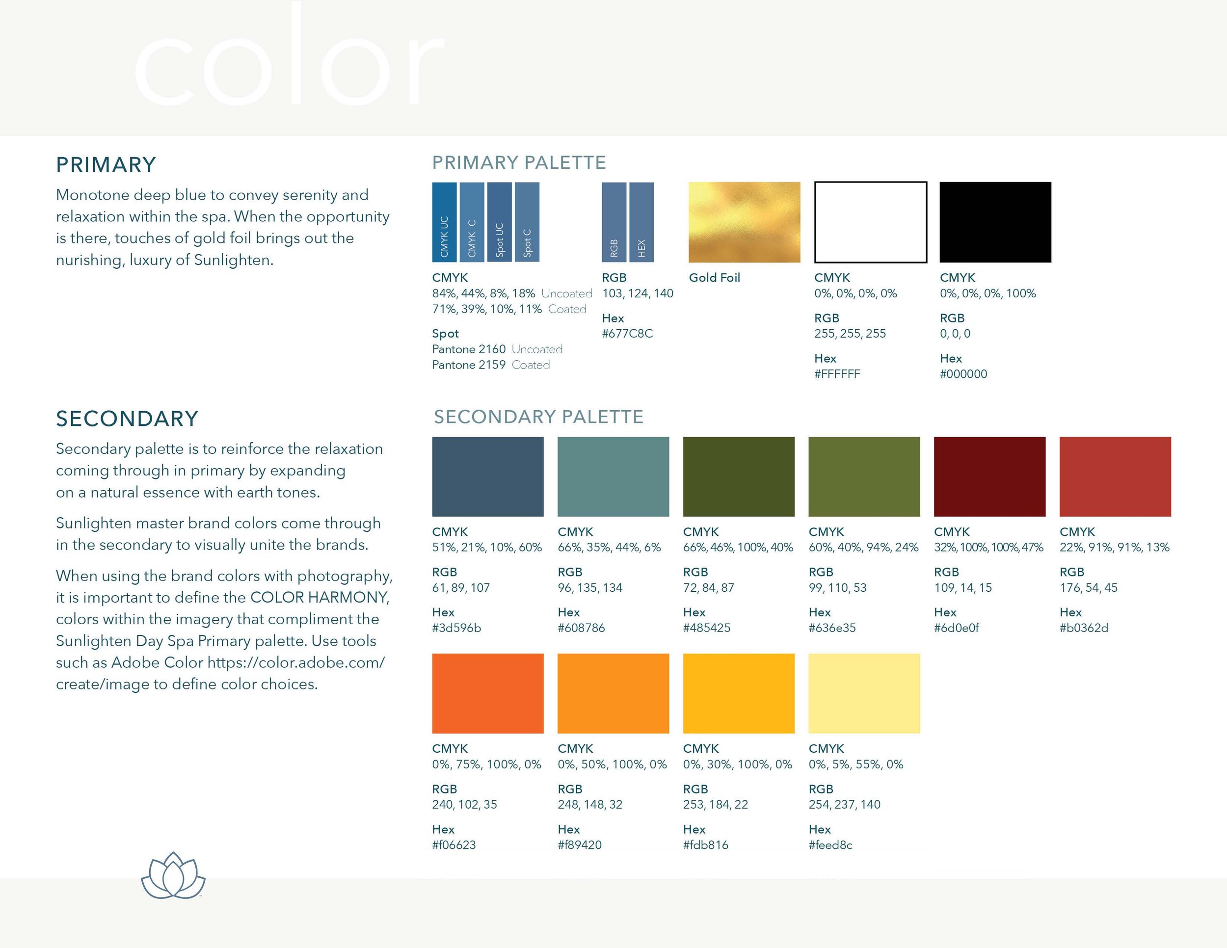
the logic of color
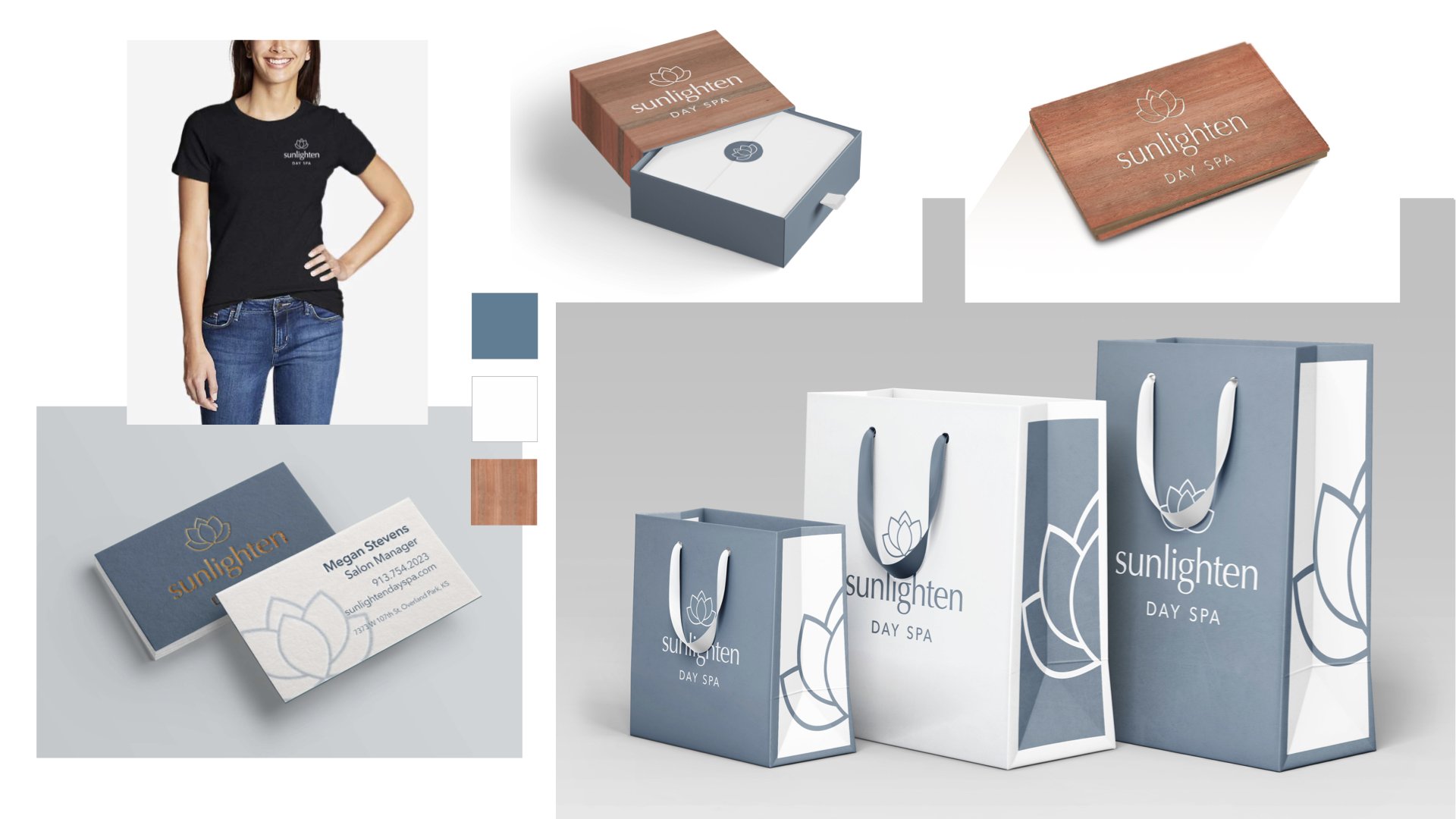
Color was the opportunity to give the brand real meaning. Using color theory as a strategic tool, I mapped brand attributes across a color grid to establish the right emotional territory before touching a single swatch. The goal was a muted, relaxing tone that reflected the experience of being inside the space. After exploring gradients and combinations, a soothing monotone light blue with subtle grey undertones emerged as the clear direction.

Color origin
The chosen color carries more history than it might first appear. It pays homage to the origins of spa culture, specifically the hot water bath treatments used after ancient battles, while simultaneously evoking a natural, earthy calm. Trust and tranquility in a single tone.
bringing it to life
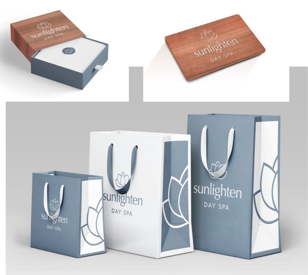
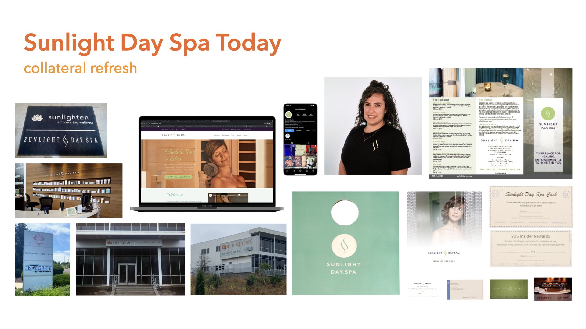
With the identity finalized, the work moved into application. Printed collateral, menus, and uniforms were unified under the new system, with the monotone palette creating a consistently soothing presence across every touchpoint. To connect the day spa more explicitly to Sunlighten's sauna heritage, I explored material details that extended the brand story: laser-cut gift cards and digitally printed box covers that mirrored Sunlighten's signature eucalyptus wood grain. The result was branding that felt like an extension of the sauna experience itself rather than a separate product.
into the space
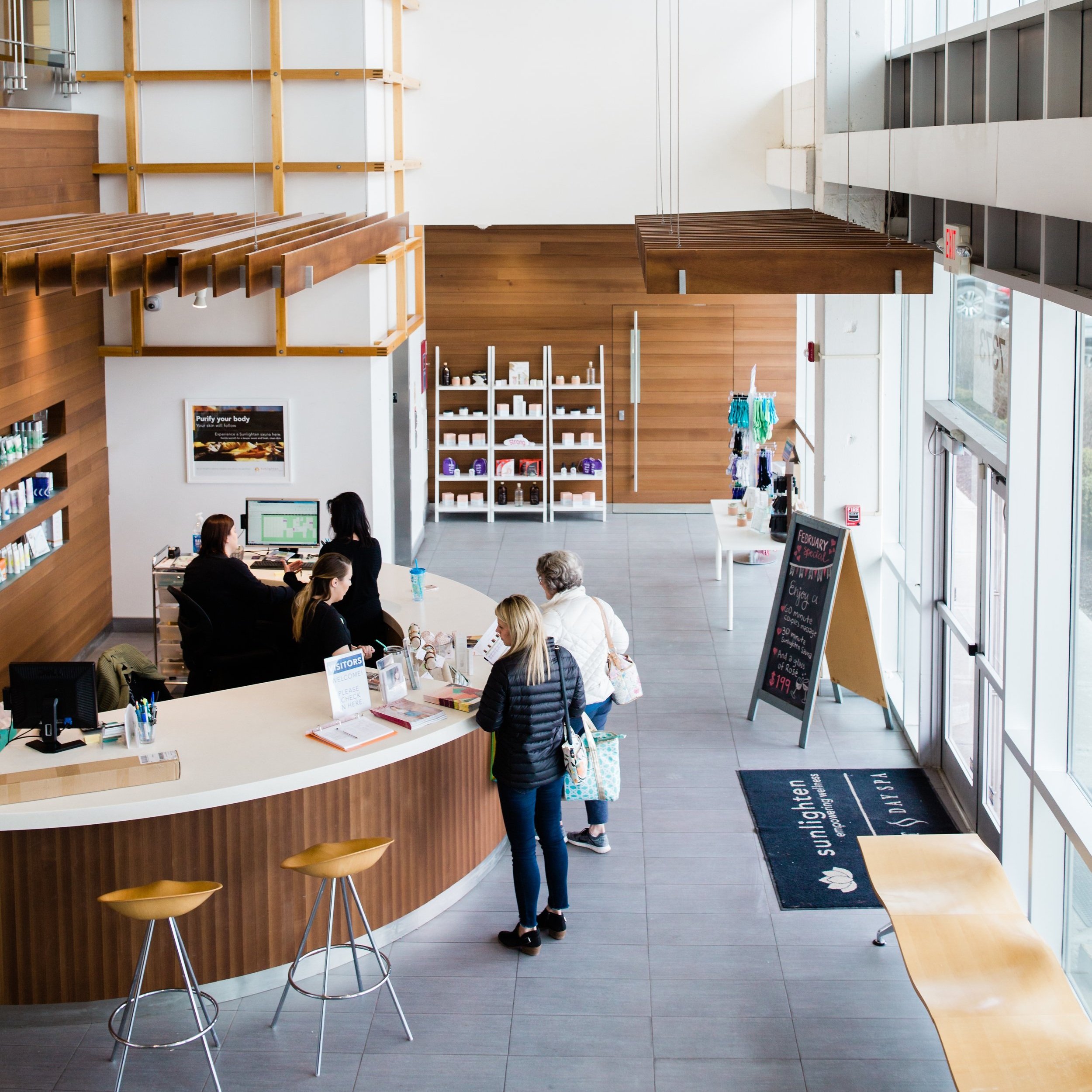
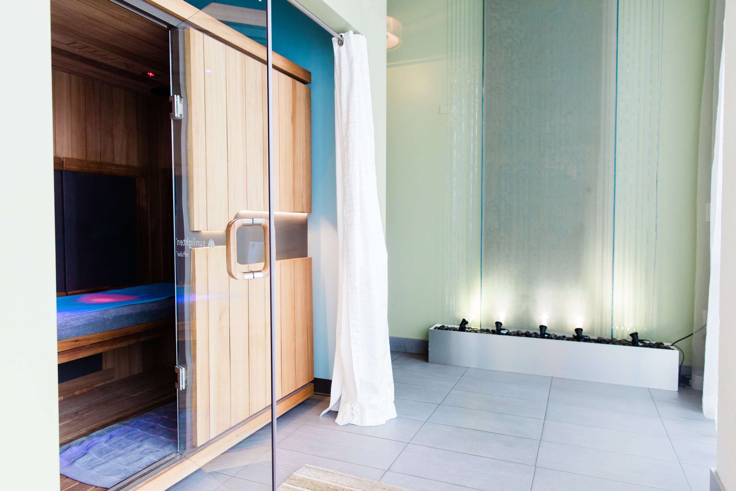
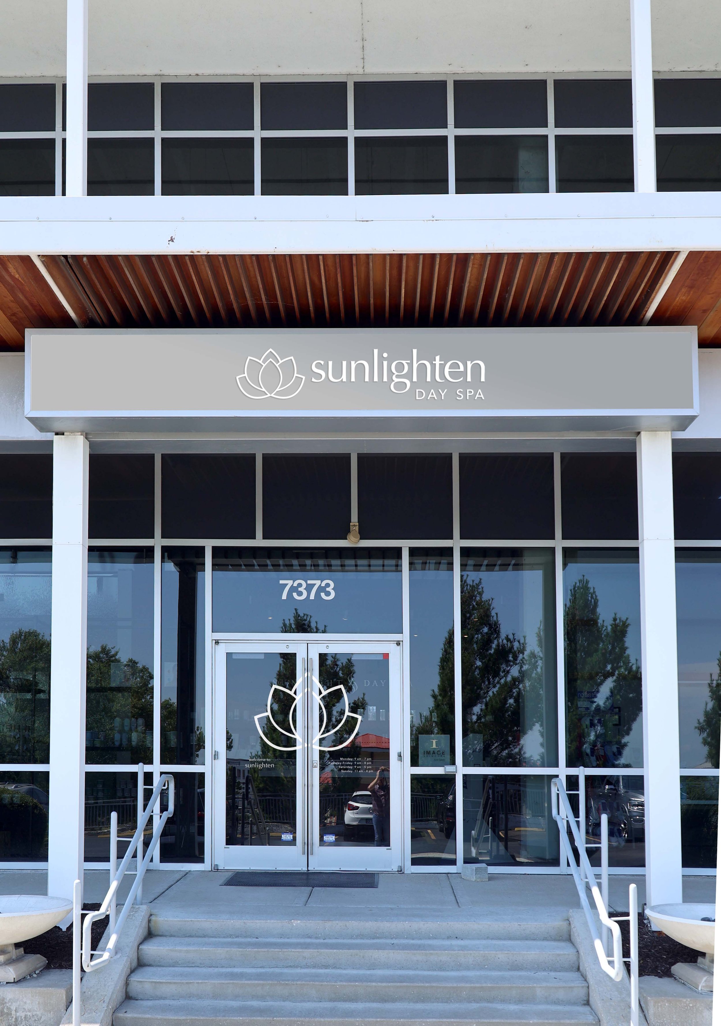
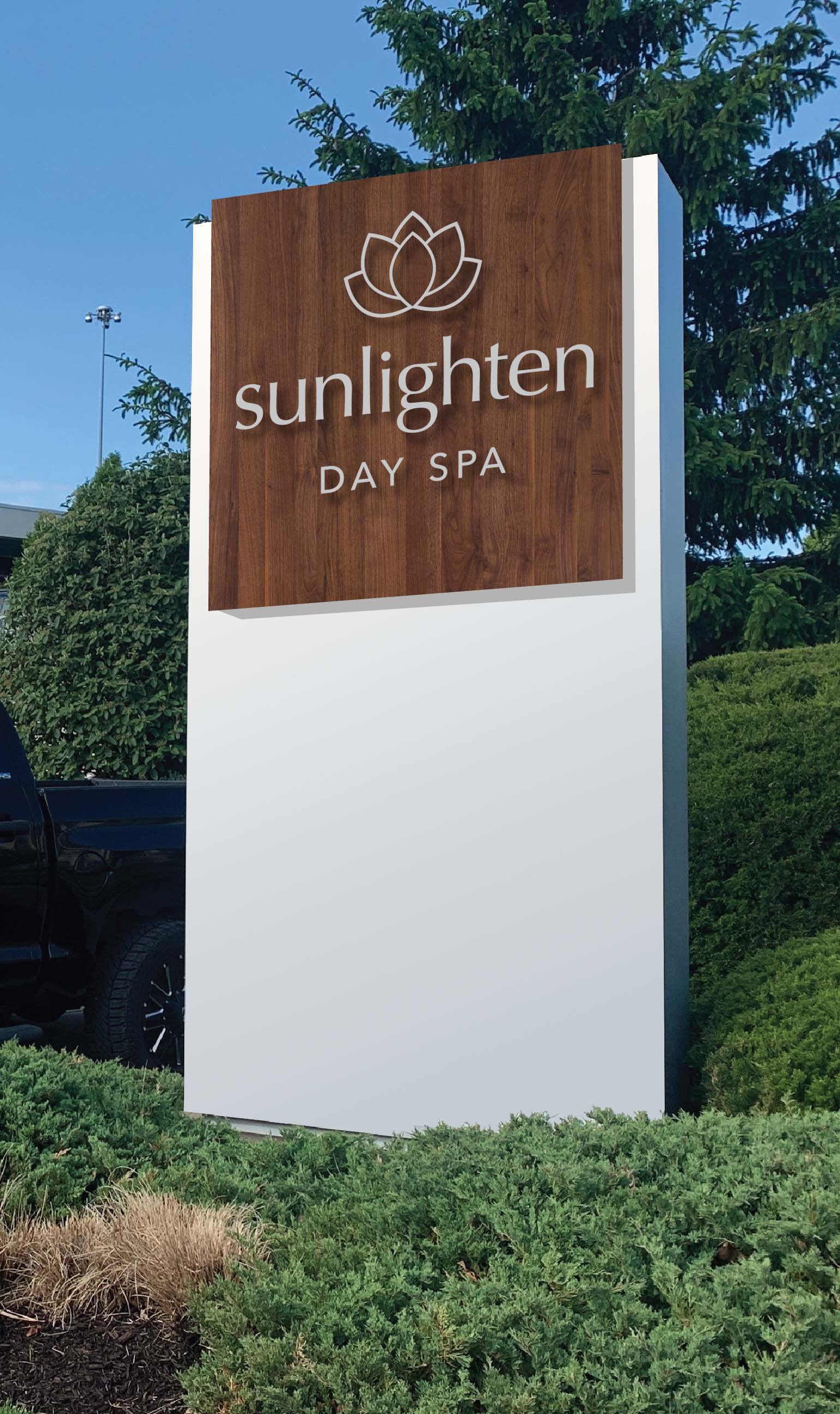
The final phase brought the brand into the physical environment. Focusing on the entryway and parking lot monument, the design incorporated natural wood elements to honor the sauna origin alongside vinyl applications that added lightness and legibility. The goal was simple: the moment someone arrived, the space should already feel like the service they were about to receive.