kansas athletics
In 2017, the University of Kansas completed a full rebrand. The Athletics department wanted to honor the new identity while developing their own distinct visual language rather than simply applying the master brand directly. As the in-house graphic designer for KU Athletics Marketing, the work was to interpret and extend that identity across the stadium environment, determining how the brand showed up at scale for fans, players, and the broader KU community.


team spirit
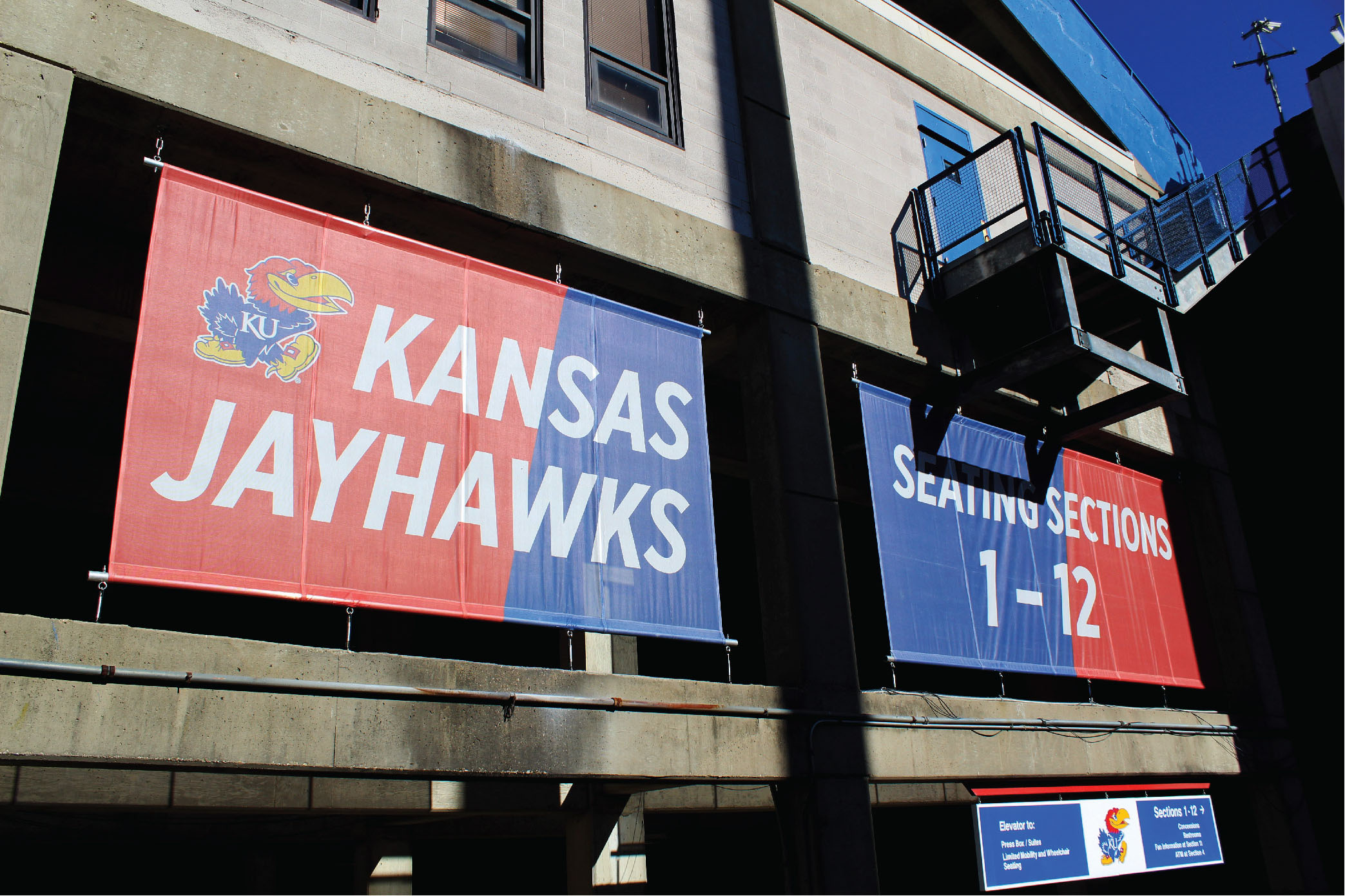
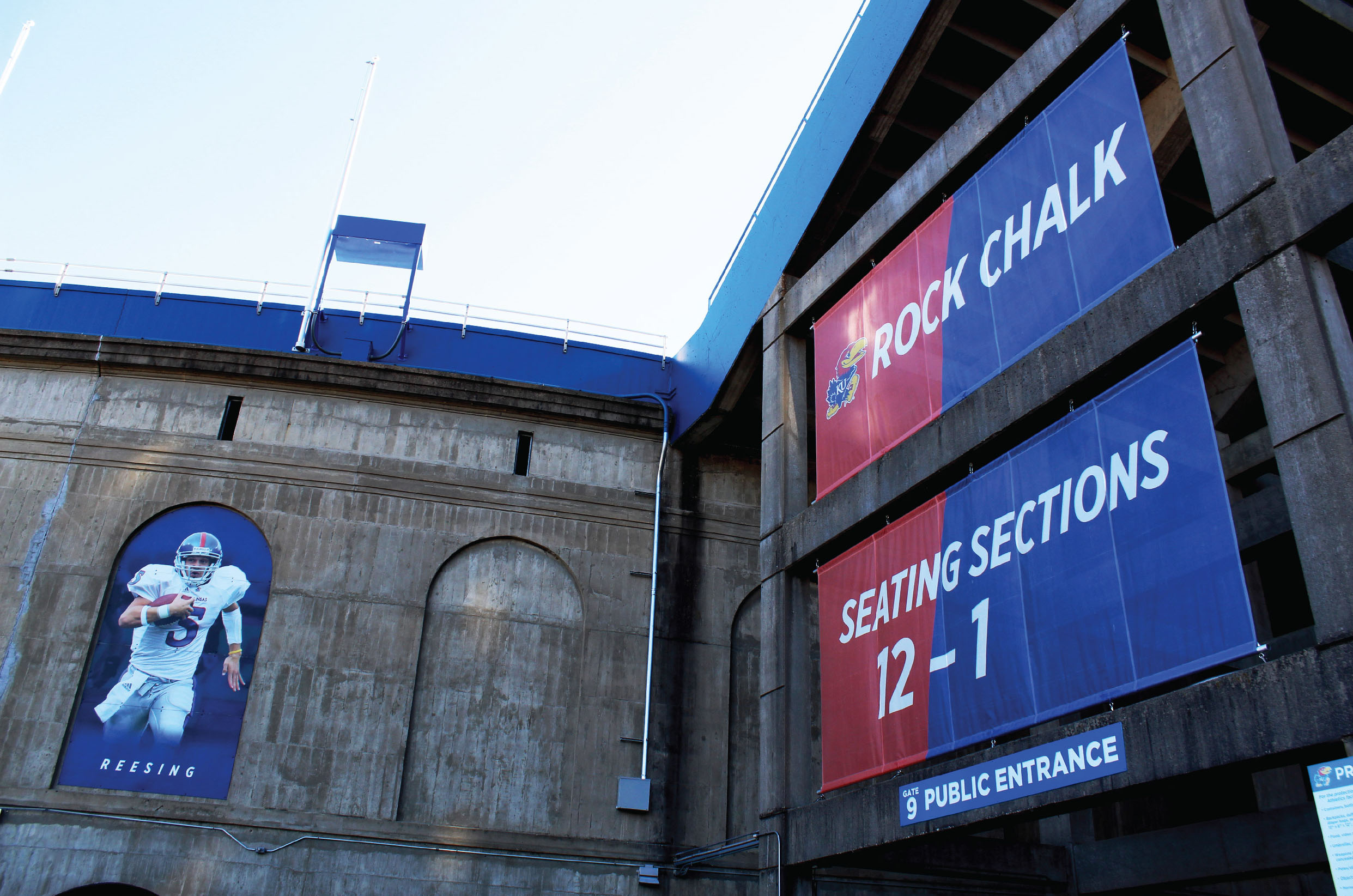
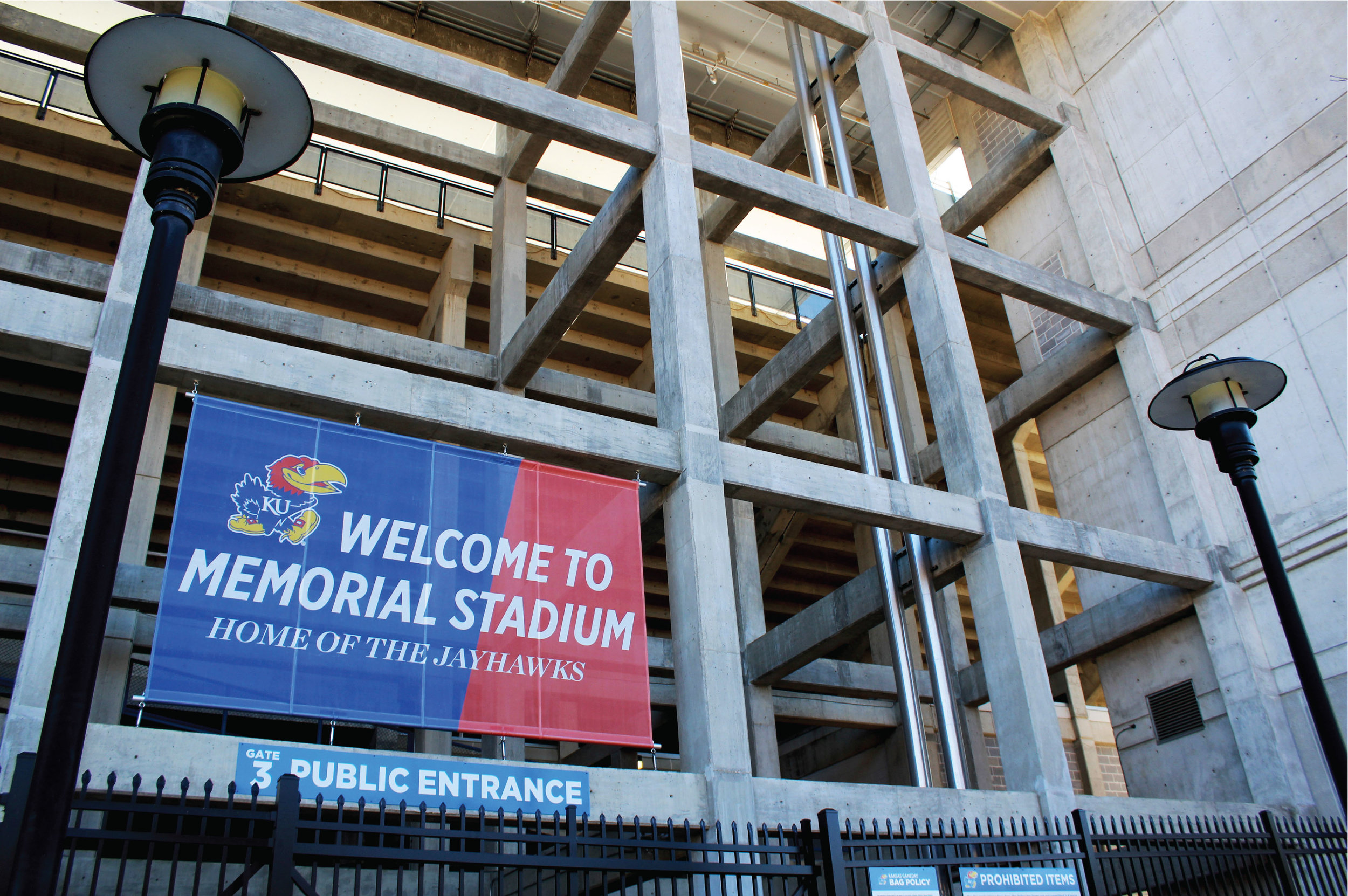
The angle from the K in Gotham Italic became the defining design element, used as a consistent division of color across advertisements, signage, and stadium installations. Billboard executions ranged from a standalone "Rock Chalk" statement to a sequenced "Rock," "Chalk," and "Jayhawk" series installed along Kansas I-70, building anticipation for fans heading toward Memorial Stadium.
beauty on a budget
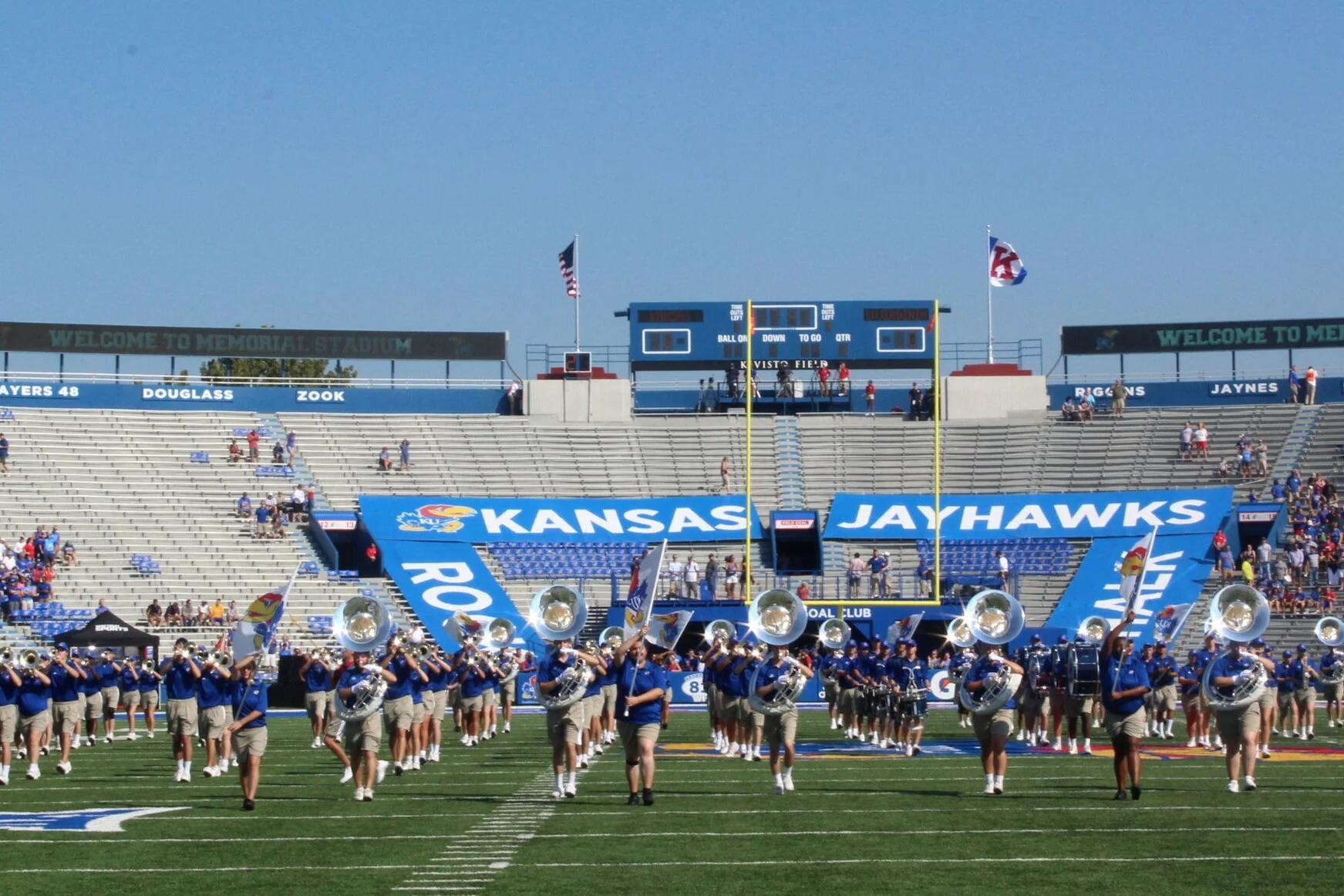
Adding color and identity to a stadium environment on a tight budget required finding high-impact opportunities within existing infrastructure. New banner installations communicated seating areas, celebrated past players, and reinforced Rock Chalk pride throughout Memorial Stadium. Additional pieces included scoreboard graphics, bowl flags honoring every football bowl game victory, and environmental design for the Field Goal Club, a new premium seating area added in 2017.


